As sort of a followup to my thread Some Thoughts on Game Design (
iwannacommunity.com/forum/index.php?topic=2178.0,) I want to touch on some elements of visual design that might be of use to people who know how to make games, but are not entirely set on what they want to make first or next. As with my previous thread, this is entirely based on my experience in making fangames, some education in visual arts, and way, way too much time spent watching streams and reading chat.
This is about much more specific things than my last piece, so it is quite a bit shorter. I will be speaking generally about some concepts, and then transitioning into specific examples and recommendations.
Styles of Visuals:
For the purpose of this discussion, I am going to classify the visual style of every visual element of fangames as being realistic or abstract. This is not strictly accurate, since even the most realistic fangame is extremely removed from an accurate depiction, but it's about as simple as I can make the dichotomy here.
- Realistic visuals make at least an attempt to align with something in the real world. Bricks that interlock, water that flows, or even just clouds in the sky all fall under this broad definition. Even the generic gray metal tiles that come in most engines might be included here.
- Abstract visuals are extremely removed from what is real or even coherent in a setting. The scrolling grid background is a good example of this, as is the generic solid-color tiles that you see pretty regularly in these games.
It's important to realize that essentially every fangame has a mix of these two styles. The save sprite that comes packaged with every engine is relatively abstract, while the player sprite is relatively realistic in comparison. Thinking of one style or another is flawed. What is important is considering how you as a creator can make your game better by thinking critically about how the visuals are constructed.
Consistency:
As with gameplay design, consistency is important in choosing the proper visuals for your project. This is by no means to say that there should be no variation in the choices for tilesets and sprites. Indeed, variation is necessary to keep the experience interesting for everyone but the most gameplay-focused players. When I say consistency I am refering to maintaining the blend between abstract and realistic resources.
Imagine a screen that makes great effort mirroring the interior of a castle. There are stone bricks, some immitation of depth, windows to the outside, etc. Even a custom save has been designed to fit more closely with the visual style. If a player transitions from several screens of that style to one that is a kaleidoscope of bright but undirected colors and abstract objects (for instance, jump refreshers,) they would have good reason to question what exactly happened. This is not the end of the world of course, but it jars the player from any immersion you have created in the first place, and breaks any suspension of disbelief you have obtained when the player remembers that they are indeed playing a game.
Because you are almost always going to have some abstract visuals along with the realistic ones, a general goal should be not creating a sudden shift like this without reason. If you have 75% realistic resources and 25% abstract ones, strive to not reverse that balance in between screens. Transition rooms can go a long way if you need to switch from one to the other, blending the opposing styles for at least one screen and offering the player a chance to see what they are about to enter as opposed to springing it on them.
Colors:
Personal taste is going to matter a lot when it comes to color selection and I'm not exactly qualified to talk about color theory as it exists in the art world, so I'll just make a few notes to consider here.
- Blends of colors and more subdued tones are generally going to be what you use in more realistic settings. Using two shades of the same color can add a lot to whatever you're making (as opposed to one flat color.)
- When choosing a background (even if it's not a solid color,) be sure to consider how it interacts with your other visual choices. Black makes it hard to see the outline of the player and spikes for example. Readability is very important in any game that has challenging platforming.
- Darker colors usually go with a more subdued atmosphere, whereas lighter ones are generally more upbeat.
- Remember that people will be staring at your game a lot, especially if it's a longer one. Extremely vibrant colors (certain shades of blue in particular) can be hard on the eyes.
- If you're using flux or a monitor with adjustable blue light settings, remember to check how your game looks on monitors without them.
With that out of the way, let's talk about some specific examples of how visual choices can work for or against you in terms of making a coherent game experience.
Styles of Visuals:
As I said repeatedly in my last thread, the most important thing when you're designing a game is to have a specific goal in mind for what you want your players to experience. This is just as true when designing a visual style for your game. Plenty of things that are frivolous in terms of practical gameplay can be used to promote whatever atmosphere you are aiming for.
Because it was my biggest experience designing original graphics, I'm going to talk about I Wanna REDACTED the REDACTED for a bit. From the start, I wanted to make a game that had a solemn, vaguely scientific atmosphere. In retrospect there was a lot more I could have done, but here are some of the things I think ended up promoting that feeling.
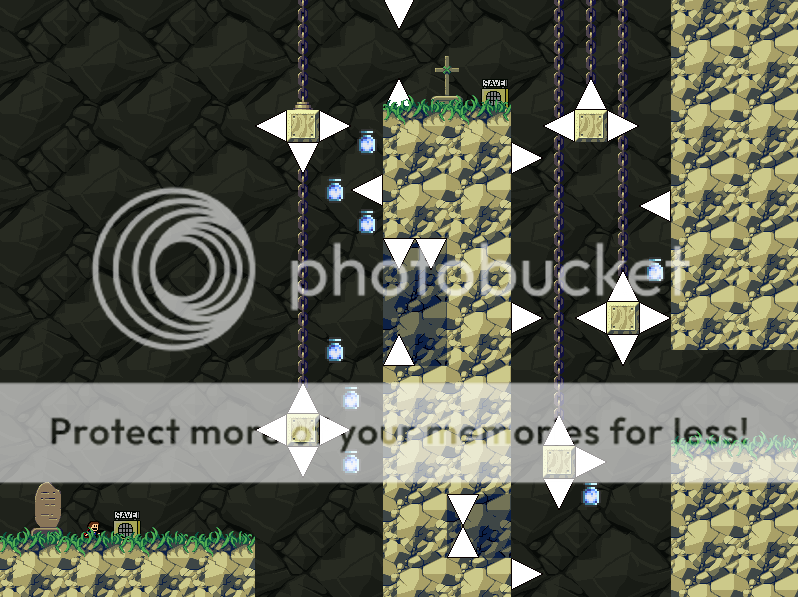
I choose a white background for the laboratory sections of the game because the color has a lot of connotations with cleanliness and sterility. It's also an easy color to create contrast with, since using darker colors for blocks doesn't make platforming any harder (as opposed to using it as the background.) The lines exist to create texture, and provide a certain sense of realism to an otherwise abstract setting. Something to note is that they are a fairly neutral color, breaking up what is otherwise an uncomfortable imagine to look at. While a slightly uncomfortable setting was what I was aiming for, that is different from making it outright unpleasant to be looking at. The lines also allowed the possibility for some visual accents such as these:

They break up the consistency of the black and white screens with some splashes of vibrancy, and add to a bit of mystery regarding the setting itself.
Unfortunately, the way I designed this left me with an annoying visual problem, which is a large number of visual tangents. Looking closely at the screenshot, you can see that some things don't quite line up in terms of the background grid, foreground tiles, and foreground spikes. If I had to make recommendations to other people considering the same sort of thing, it would be to use tiled backgrounds that do not fit as perfectly on the 32x32 (or 16x16) grid so as to differentiate more between the background and foreground.
Throughout the rest of the game I used an array of visual miscellanea to create the sense that the player was traveling through a setting with at least some basis in reality. Desks, computers, and filing cabinets all are stables of offices (even if my renderings of them were not particularly detailed.) The shocking number of disembodied heads and flickering screens full of weird stuff were intended to be ominous. Enormous containment tubes full of mysterious liquids (and for some reason jump refreshers) as well as an abundance of glowing portals lent themselves to the weird science atmosphere I was trying to create. Almost none of these things had any real effect on game play, but without them the setting feels empty, and does not even begin to convey the emotions I wanted.
All of those props are about as realistic as can be found in a fangame. That is to say, you could reasonably find things with distinct similarities in reality without it being too strange. If you're looking to make a game with extremely abstract visuals but is more than the generic single color block, single color background that we've all come to expect, I would suggest examining the games by the GENKI creator. There are some excellent example in their games of abstracted but consistent visuals that are used to create, well, weirdness.
Consistency:
Since I warned against inconsistency in terms of the blend of realistic and abstract visuals when I introduced this concept, I thought this might be a good place to introduce an example of how willingly violating that general rule can be used to great positive effect. In I Wanna Stop the MELTDOWN, a game I would argue to be fairly realistic in its visual style, there is a transition into almost total abstraction induced by hallucinogenic mushrooms. I have never seen anything but extremely positive reactions to this, which I would explain by the presence of three factors (aside from simply being well made of course.)
First, an actual explanation to the visual transition is provided. While logical things have never been particularly central to fangames, it's nice to be able to thing oh, that's why this thing is happening. Secondly, there is an actual transition into the new visual style, negating some of the jarring sensation that might otherwise be experiences. Third, the abstract area has a sense of internal logic to its appearance: a combination of the heart motif, light colors, and cheerful music. This creates a sense of consistency, and at least partially staves off the question of if the player is even playing the same game anymore.
Just because you have started with one distribution of realistic and abstract visuals does not mean you are bound to it for the entirety of the game, but give some thought to how your shifts in them will be perceived and how they can work in your favor. A game in which the player is slowly losing their grip on sanity, which is reflected by increasingly abstract graphics, stranger music, and more complicated gimmicks, is much more compelling as a whole than something more haphazardly thrown together, even if it has all those elements at one place or another. If your game is consistent in moving from one distribution to another, the individual changes in screens or areas do not matter as much as long as they follow the pattern.
Colors:
I don't really have much to say about them in terms of examples aside from what I noted earlier. As with everything else, just try to consider if your decisions regarding them work toward your overall goal in the creation of a game.
TL;DR:
When choosing or creating the visual elements of the game, be sure to consider how exactly your choices affect other elements of the game. Does anything stand out because it doesn't mesh with the style you've developed? Is a specific section that requires staring at the screen full of colors that hurt the eyes? There are plenty of things that deserve more consideration than they get in this day and age of design.