Author Topic: Some Thoughts on Game Design  (Read 4172 times)

Kyir

  • The Kid
  • Posts: 293
  • Normal Guy
  • OS:
  • Windows 7/Server 2008 R2 Windows 7/Server 2008 R2
  • Browser:
  • Chrome 48.0.2564.97 Chrome 48.0.2564.97
    • View Profile
  • Playstyle: Keyboard
Some Thoughts on Game Design
« on: January 31, 2016, 09:11:59 AM »
I'd like to talk about game design for a bit. According to my best estimates, I've been making fangames for about two and a half years now. That's by no means the longest among everyone, but it's not an insignificant amount of time either, and I think some of the things I've learned might be useful for newer creators. Think of the following as some thoughts for people who know how to make games, but aren't sure what exactly to do with that knowledge on a larger scale.

A few notes before I start:
  • Everything here is based on my opinions and some general observations of other people's opinions too. There are always going to be individuals with different tastes, so be sure to consider who your intended audience is.
  • Even if you think what I'm saying is reasonable, there's always a time and place to go against the grain. Blindly following good advice is only somewhat better than not following it at all.
  • And as always the most important thing is to have fun with what you're doing!

I'm going to begin with some broad concepts and then work my way down to how they can apply to individual screens and even individual segments of those screens. You can skip to the second post if you just want to read about making rooms.

Game Narrative:
This concept has a few things to do with storytelling in any other sense, but it might be easier to think of it in terms of the difficulty curves everyone's always talking about. Here are some examples:


It's a bit of a misnomer since they don't exactly need to be curves. Even a game with unchanging difficulty can be said to possess one, though it's not probably not very interesting. When I say game narrative, I'm referring to the concept of taking a player from a distinct start point to a distinct end point, with a bunch of stuff in between. This might seem like a given. Of course a player is going to start somewhere, end somewhere, and do stuff in between, but framing in this manner helps isolate important questions for the game maker:
  • How hard does your game start and how hard does it finish? How gradual is the change from one to the other?
  • How does the atmosphere you're conveying change over time? Are any abrupt shifts made for a particular reason?
  • Are your bosses or other significant events following buildup? If not, why do you want them to appear suddenly?

Again, these are all important even if you don't plan on having a story in your game.


Picture playing a game with that difficulty curve where every blue notch marks a boss. It's not a well-balanced curve in the first place obviously. The end is a bit easier than the start and there's huge variety in between, but it's made even worse by the haphazard placement of bosses. This is especially true if the bosses themselves are vastly more or less challenging than the platforming.

Imagine doing a few basic jumps, fighting an incredibly challenging boss, and then getting right back to the same few basic jumps. There's no sense of progression, no sense that beating the boss accomplished anything or marked a change, only the sense that an unreasonably difficult barrier had been stepped over.

Alternatively, what if the blue notches were changes in music or graphics? They don't come at significant times certainly. They probably don't mark the appearance of a new mechanic or a change in a stage. They're less offensive when placed haphazardly than bosses, but they aren't exactly doing anything for you in terms of building a holistic game experience.

I'm mentioning this at the start because it should probably be the first thing you think about while making a game. Where do you want to start, where do you want to end, and what do you want to show the player in between?

Game Flow:
You might think of game flow as the connectivity of the important points in your game's narrative. Overall you go from point A to point Z, but to do that you usually need to go from A to B, B to C, C to D, and so on. Unless your game only consists of a single room you are going to have to address how the player moves from one to another. You may want to decide what kind of atmosphere you're attempting to create (which is why it's a good thing to consider something like that before reaching this point.)

Consider this: Not Another Needle Game (widely regarded as a classic) is a fangame with an incredibly strong and consistent atmosphere. A significant part of this is the ever-present narrator, but the way the rooms are connected plays an important role as well. The fact that nearly every room ends with a portal to the next one emphasizes the feeling of being helpless at the hands of a merciless AI. A sense of progression is maintained by the numbering of levels, but there's rarely an impression of moving in a particular direction or getting any closer to the ultimate goal. You do a thing, you get the next thing to do, and you're laughed at the entire time.

If you want to make a game with a sense of direction instead, you might want to include obvious entrances and exits to every screen that at properly linked together. This way the player can clearly see where they started and where they're going at any point, and can understand that going from one screen to another is clearly leading them somewhere. It just depends what you want players to take away from playing your game.

Determining how you're going to deal with transitioning between screens is important when it comes to pure platforming as well. There are some general things that are basically good manners at this point: don't have spikes right on the other side of a screen edge, don't teleport the player into something they need to react instantly to, (usually) give them a save immediately. You can think about this as a check against rampant difficulty peaks or valleys too. When starting on a new screen, ask yourself if what you're creating is significantly different in terms of difficulty than what was on the last one. If it is, you might want to consider re-balancing unless you're planning on a very steep curve the entire game.

Mechanics:
These also get called gimmicks a lot, but that suggests a certain cheap novelty to them. What I'm referring to could most accurately be described as “platforming accents,” but that's sort of dumb so let's stick to calling them mechanics. There's a vast array of already existing, fairly standard ones such as jump refreshers, vines, gravity flips, conveyor belts, and springs. Depending on how strict your definition of basic platforming is, you might even include water and spike triggers in that list. There are rarer mechanics too of course: triple jump segments, single jump ones, various speed augmentations, size changing, etc. Really, there are too many for me to even try listing them all, especially if I were to include the ones that only really exist in one or two games.

The reason I'm bringing this up before I talk about the actual implementation of mechanics is because there's some more large-scale consideration to be done of them. With more graphs!


This is the mechanics chart for my first game, I Wanna Descend Into Hell. As you can see, I started out with jump refreshers and then kept adding more mechanics, never really removing any of them completely. Not that everything I implemented appeared in every screen, but none of them were ever particularly absent for a long stretch of time once introduced. As you might imagine, it got a little painful by the end to try and stuff everything together at once.


This is the same sort of chart for another game of mine, I Wanna REDACTED the REDACTED. There was significantly less overlap until the near the end. This led to a few accusations of staleness from certain people, but I doubt they would dispute that it was a much cleaner experience than my first game.

I don't present these charts to suggest that there is a right way and a wrong way to implement mechanics in your game. It's perfectly reasonable to have one mechanic a stage, or none at all, or all of them all the time. I would just encourage you to devote some thought to why you're making it the way you are. A game with more isolated fragments is probably better suited thematically to a fractured approach, whereas one where the player is supposed to be building up to something big the entire time would probably mirror that in mechanics. It all leads back to that original question of how exactly you want things to change from the beginning of the game to the end.

Platforming:
I don't want to say too much about going above, under, and around spikes and apples in this section. We'll definitely come to it more later. I just want to give a few recommendations of things to think about when you're working out what exactly kind of game you want to make.
  • Can you actually play the game you're making? If not, I would recommend not making it in that state. If you insist, you absolutely need to find people to test it who can.
  • Do you expect any particular knowledge from the player? Things like aligns are pretty common knowledge these days, but you may want to decide to what degree you'll make that knowledge required to beat your game.

So now that that's out of the way, let's talk about room design!
« Last Edit: January 31, 2016, 07:59:11 PM by Kyir »

Kyir

  • The Kid
  • Posts: 293
  • Normal Guy
  • OS:
  • Windows 7/Server 2008 R2 Windows 7/Server 2008 R2
  • Browser:
  • Chrome 48.0.2564.97 Chrome 48.0.2564.97
    • View Profile
  • Playstyle: Keyboard
Re: Some Thoughts on Game Design
« Reply #1 on: January 31, 2016, 09:12:40 AM »
Basic Layout:


This is what a lot of people start with. It's a perfectly reasonable thing to start with, but it's also fairly intimidating. You have no idea where you want the player to go, what you want them to do on the way, or what obstacles they're going to need to get around in the process. Unfortunately, the natural response is just to make an exit and start working backwards to something like this:
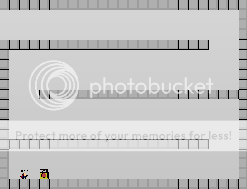


In general, I try to avoid saying anything is outright bad. It stifles creativity to do so. The problem is that this layout stifles creativity too. Unless you plan on introducing some impressive mechanics, a game full of back and forth corridors like this just isn't going to be that interesting. Most of the times it just ends up being a bunch of generic jumps, like so:
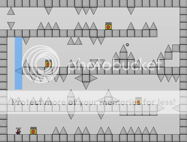


There's just not a whole lot to say about it frankly. You might be able to twist it into something that really shines once. Maybe you'll wring gold from the general layout two or three times even. You can get a lot more leniency from the player if you're willing to step a bit beyond your first inclination when it comes to room layout though, so let's try again. We start with the same empty room, but instead of a back and forth passage let's just throw some shapes in:
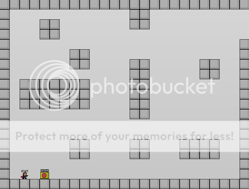


There's so much more that you can do right off the bat. You can have the same general back and forth if you want, but with a bit more variety:
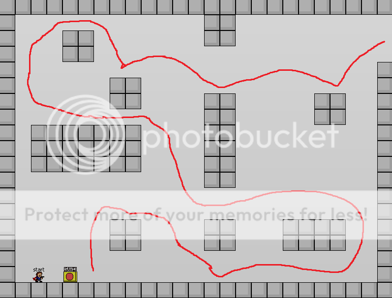


You can have a much more vertical path than you could have before:
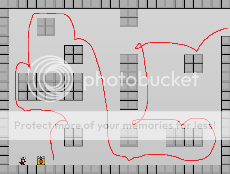


If you include triggers or other mechanics, the variety increases even more. To boil all that down: unless you already have a firm idea of what a room is going to look like when you start making it, beginning with just a few shapes scattered around a room can provide you with just enough possibility to be inspiring without being overwhelming.

A few guidelines that might help:
  • Try to fill the room. Even if you take things out later, it's easier to make too much and remove some than too little and have the game feel empty (unless that's the point of course.) There are plenty of instances of people using less than the typical 800x600 pixel allotment without it hurting them, but think about why they're doing it if you plan on following suit. Graphical flourishes can also help fill space unused by platforming.
  • Even if you avoid the usual back and forth hallway completely, be sure your replacement doesn't become as overused in your own game.
  • Consider the direction of movement that we talked about before. Entering on the left side of the screen and leaving the right over and over is unnecessarily restricting even if the path there varies. Try entering from the top left and leaving from the middle bottom, or entering from the top right and leaving from the bottom right.

Jumps:
And so we reach the section that will probably annoy the most people. There are plenty of other places where you can see the formulations for the usual jumps, so I won't go into them here. I'm also not going to sit here and try to tell you to not use generic jumps. We all do it at some point or another. This is another opportunity to consider the spirit of your game. If you're comfortable putting six or seven gate jumps in a row and you genuinely think it's fun, you should feel free to do that. Just know that not everyone necessarily looks as favorably on that as you might.

If you're less comfortable repeating the same jumps as everyone else but you're having trouble thinking of variety, let's refer back to that more interesting layout we were just using. Here's a version of it only using jumps I've seen hundreds of times:
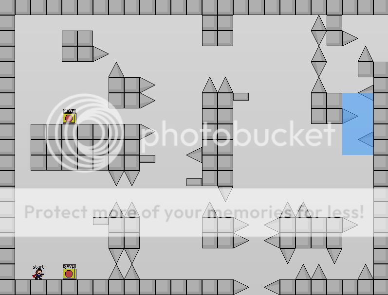


There's nothing particularly wrong with this room (except for maybe the obvious skip.) Even with non-gray graphics I would argue it's pretty boring though. Three of the jumps are functionally the same, there's nothing super innovative about a diamond, and even the corners are oriented the same way. The problem is that watching hundreds of hours of these games has made certain jumps seem standard, or even necessary is certain places. Diagonals fit into their spots, as do diamonds, corners, etc. That's not to say that they have to go there, but rather that it can be hard to break out of the expectation that they should go there. In the case that you feel like you're having this problem but don't want to introduce any mechanics quite yet, I would recommend changing the basic layout of the room some more.
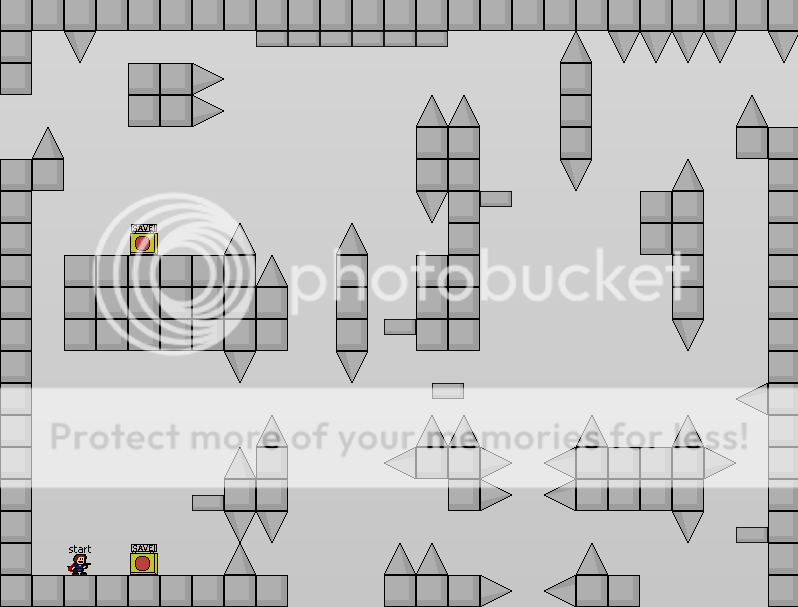


I still wouldn't be entirely happy with this personally, but you can see how minor additions and removals to the landscape can drastically change where one is inclined to put spikes. I must admit I'm slightly biased here in the first place, but just remember that if you want to go with the old standbys there's absolutely nothing stopping you! I'm just looking to raise some alternatives to the standard.

Speaking alternatives, let's talk about jump refreshers!

Mechanics:
Not only jump refreshers of course, but everything that's additional to the usual platforming. I got into what mechanics were in a literal sense earlier, so now we're going to talk about them as possibility extenders. Here's a (not to scale) representation of everywhere the kid could conceivably reach in this room.
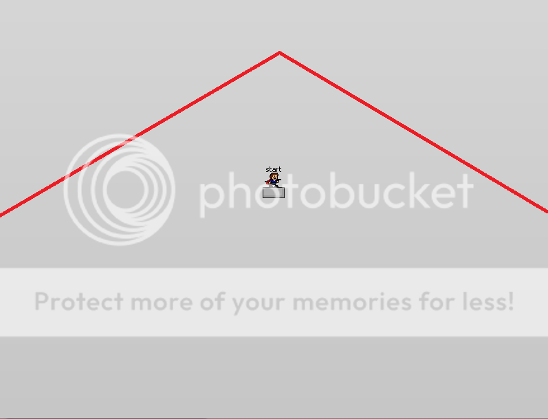


Everything above the red line is too far away, everything below it is not. If you add a jump refresher you would need to raise the red line though. Add a gravity flipper and you would have to invert it. Add water and there's no restriction at all. This is the intrinsic benefit of having additional mechanics in your game. Usually the player only has two jumps, but suddenly they have three! Or four! The rules that usually apply to what is possible and impossible suddenly no longer have any sway over you! If you ever reach a point where there's no feasible path for the player but you don't want to edit the room, there are always ways you can fix that!

Your ultimate goal with new mechanics should be designing the platforming around them instead of using them to repair faulty platforming, but in all fairness your first few games probably won't be your magnum opus anyway. There's no shame in experimenting even if it doesn't create the most elegant solution. A good rule of thumb for segments with mechanics is “if you can do it without the [jump refresher/gravity flip/water/etc,] you need to make the base segment more complex.”

Game Flow:
This time it's on a smaller scale, but let's talk about getting from point A to point B inside a room. Let's say point A is the first save and point B is the second. In most cases that's not a whole lot of platforming, but it's still important to consider how the player is going to be making that movement.


In this segment the player will be dealing with three individual points with their own difficulty. They will do an easy jump, then a tricky jump, then a hard jump. The worst you can say about it in terms of a difficulty curve is that the last jump is significantly harder than the first. The player has a sense of progression completing the three jumps despite that, going from something they can do fairly regularly to something that may take a while, and since it's a fairly short save there will be ample chances for them to get to the end.

A save like this will be called boring almost every time despite that. The first problem is that the player's direction is incredibly simple. It's a broken down segment of an already boring layout, and there's really no disguising it. The second problem is the repetition in the movements required of the player. To simplify a bit, the only thing required of them is holding right, jumping once, then jumping twice, then jumping twice again. Even if it's not the easiest thing in the world to execute, it's boring.

Most people expect a change in difficulty over time in a game, which means a change in difficulty between rooms, which usually ends up meaning a change between and inside of segments. Players expect to be forced to change what they're doing over the course of these segments no matter how the difficulty shifts. There's more than one directional arrow for a reason after all. Try varying the height at which they land, the length of each individual jump, and whatever other factors you can think of just to force the person playing to use the maximum range of movement possible to traverse the distance between saves.

Game Narrative:
And so we're back to this. I mentioned before that you want to decide on the atmosphere of your game before you start working on it. This is largely because creating an atmosphere is inevitable. Even if you have no music, an incredibly plain tileset, and just the most basic platforming, the atmosphere you have created is boring but not nonexistent. You may as well be the one directing it if one is going to exist at all.

Graphics are a bit hard to deal with since communicating visually in 32x32 tiles is a challenge, so let's just go right to music. You're probably going to have it in your game in some form! How should you pick it? It's not that hard really. Consider the important points on whatever kind of narrative chart you've constructed for yourself. Do you want the player to be getting excited as the boss nears or should they be dreading it? Should the new mechanic be filling them with energy or grinding them into dust? You can convey these sorts of things with music!

Unfortunately, I can't provide you with an easy chart or anything for that. Just listen to a wide variety of music, pick ones that convey the right emotions to you, and hope everyone else feels the same. Try running it by a few people! There will almost always be someone  who gripes about the music anyway. An easy way to get an idea for it is to look at media embodying  that particular emotion. Find a game filled with sorrow if you want to find some sad music, etc.

Going back to graphics for a moment, you can occasionally do the same depending on how resourceful you are. Find a game with a similar feel for the one you're going for and start there. Sometimes what's available can be surprising!

That's all!
I realize that to some people, this doesn't answer your questions at all. If you're having a lot of trouble with the mechanics of design you can always try watching someone stream it or reading a book about it, and if you're having coding issues you can always ask here. What I tried to do was provide a framework for thinking about a game as an entire entity to give some direction to that creative process.

TL;DR: Where does the player start (in terms of location, emotion, and difficulty,) where do they end up, and what happens along the way? If you can answer these, you probably have a pretty good framework for a game.
« Last Edit: March 26, 2019, 09:49:41 PM by Kyir »

Sephalos

  • Spike Dodger
  • Posts: 228
  • OS:
  • Windows 7/Server 2008 R2 Windows 7/Server 2008 R2
  • Browser:
  • Chrome 48.0.2564.97 Chrome 48.0.2564.97
    • View Profile
  • Playstyle: Gamepad
Re: Some Thoughts on Game Design
« Reply #2 on: January 31, 2016, 12:38:59 PM »
The word "jump refresher" only appeared 6 times during that entire tutorial. Kyir i am so proud of you right now.

patrickgh3

  • Spike Dodger
  • Posts: 169
  • stay optimistic! :D
  • OS:
  • Windows 7/Server 2008 R2 Windows 7/Server 2008 R2
  • Browser:
  • Chrome 48.0.2564.97 Chrome 48.0.2564.97
    • View Profile
    • Github
  • Playstyle: Keyboard
Re: Some Thoughts on Game Design
« Reply #3 on: January 31, 2016, 04:44:19 PM »
Great read. I like the way you frame game flow, mechanics, and atmosphere as all building on each other, and how it's important to keep that in mind. I often just go with the flow and design whatever feels right to me, but I think I'll benefit from explicitly sitting down and thinking about the big picture like that.

As for room layout, I tend to design jump-by-jump or movement-by-movement instead of following a planned path, which works for me, but to each their own. Overall your article is well-written and articulate, if a little bit lengthy, and is great advice. Definitely recommended reading; seeing how other people go about making games can give you valuable insight. Thanks for writing this Kyir.
« Last Edit: January 31, 2016, 04:57:17 PM by patrickgh3 »

Kyir

  • The Kid
  • Posts: 293
  • Normal Guy
  • OS:
  • Windows 7/Server 2008 R2 Windows 7/Server 2008 R2
  • Browser:
  • Chrome 48.0.2564.97 Chrome 48.0.2564.97
    • View Profile
  • Playstyle: Keyboard
Re: Some Thoughts on Game Design
« Reply #4 on: January 31, 2016, 07:39:18 PM »
Thank you both for your feedback, though I'd put that in airquotes for Seph. I think designing segments individually without planning out a path through the room is a fine strategy too! It lets you focus on the thing at hand instead of worrying about how it fits in overall. I mostly wanted to illustrate how many more overall opportunities that room layout offered compared to others, though it's hard to plan too much in my opinion.

Arclooper

  • Wannabe
  • Posts: 26
  • The plot chickens
  • OS:
  • Windows 7/Server 2008 R2 Windows 7/Server 2008 R2
  • Browser:
  • Firefox 44.0 Firefox 44.0
    • View Profile
  • Playstyle: Gamepad
Re: Some Thoughts on Game Design
« Reply #5 on: February 01, 2016, 08:33:52 AM »
This is some really good reading material for new makers, good job Kyir, I definitely could take some things out of this for myself and will recommend this as a read to anyone that says they're interested in trying their hand at making a fangame (although a good deal of this applies to game-making in general, not just fangames)

Although I also prefer the individual segment way of making things, mixing it up helps avoid creative blocks and possibly adds variety since these different methods might yield some pretty different layouts a lot of the time.

Very easy to follow along your explanations, hope you have some more stuff up your sleeve like this

Kyir

  • The Kid
  • Posts: 293
  • Normal Guy
  • OS:
  • Windows 7/Server 2008 R2 Windows 7/Server 2008 R2
  • Browser:
  • Chrome 48.0.2564.97 Chrome 48.0.2564.97
    • View Profile
  • Playstyle: Keyboard
Re: Some Thoughts on Game Design
« Reply #6 on: February 02, 2016, 11:06:45 AM »
I don't have any more planned in particular, but I would be interested to see other people making threads explaining their design philosophies personally. For a "Game Design" forum we really don't see many threads about it.