Show Posts

This section allows you to view all posts made by this member. Note that you can only see posts made in areas you currently have access to.


Topics - Kyir

Pages: [1] 2
1
User-Made Creations / (WIP) I Wanna Defy the Director
« on: March 31, 2017, 05:34:54 PM »
I don't really see myself finishing this in the foreseeable future (or making any progress, really,) but I also hate to not release stuff I've made. Enjoy this absolutely stellar ~20 minutes (maybe?) of content. I'll keep stuff updated if I ever do happen to get further with it.

https://www.mediafire.com/file/35yqgnk87rgy350/I+Wanna+Defy+the+Director.zip

2
Game Design / Crow Once, Praise Twice
« on: March 28, 2016, 08:37:43 PM »
(For people whose first language isn't English: to crow is to "say something in a tone of gloating satisfaction.")

I have observed two problems:
  • People around here are too negative about everything. I say this as a negative person who is struggling to improve.
  • People don't talk enough about game design in the game design forum.
To remedy both problems, I suggest the following. People who have made games (or are working on games currently) should say name one feature of a project of theirs that they are proud of, and two features from other people's projects that they liked. In addition to less general negativity everywhere, it would be nice to get more of an insight into specific features that other people enjoy.

3
Game Design / Some Thoughts on Visual Design
« on: February 21, 2016, 07:37:21 PM »
As sort of a followup to my thread Some Thoughts on Game Design (iwannacommunity.com/forum/index.php?topic=2178.0,) I want to touch on some elements of visual design that might be of use to people who know how to make games, but are not entirely set on what they want to make first or next. As with my previous thread, this is entirely based on my experience in making fangames, some education in visual arts, and way, way too much time spent watching streams and reading chat.

This is about much more specific things than my last piece, so it is quite a bit shorter. I will be speaking generally about some concepts, and then transitioning into specific examples and recommendations.

Styles of Visuals:
For the purpose of this discussion, I am going to classify the visual style of every visual element of fangames as being realistic or abstract. This is not strictly accurate, since even the most realistic fangame is extremely removed from an accurate depiction, but it's about as simple as I can make the dichotomy here.

  • Realistic visuals make at least an attempt to align with something in the real world. Bricks that interlock, water that flows, or even just clouds in the sky all fall under this broad definition. Even the generic gray metal tiles that come in most engines might be included here.
  • Abstract visuals are extremely removed from what is real or even coherent in a setting. The scrolling grid background is a good example of this, as is the generic solid-color tiles that you see pretty regularly in these games.

It's important to realize that essentially every fangame has a mix of these two styles. The save sprite that comes packaged with every engine is relatively abstract, while the player sprite is relatively realistic in comparison. Thinking of one style or another is flawed. What is important is considering how you as a creator can make your game better by thinking critically about how the visuals are constructed.

Consistency:
As with gameplay design, consistency is important in choosing the proper visuals for your project. This is by no means to say that there should be no variation in the choices for tilesets and sprites. Indeed, variation is necessary to keep the experience interesting for everyone but the most gameplay-focused players. When I say consistency I am refering to maintaining the blend between abstract and realistic resources.

Imagine a screen that makes great effort mirroring the interior of a castle. There are stone bricks, some immitation of depth, windows to the outside, etc. Even a custom save has been designed to fit more closely with the visual style. If a player transitions from several screens of that style to one that is a kaleidoscope of bright but undirected colors and abstract objects (for instance, jump refreshers,) they would have good reason to question what exactly happened. This is not the end of the world of course, but it jars the player from any immersion you have created in the first place, and breaks any suspension of disbelief you have obtained when the player remembers that they are indeed playing a game.

Because you are almost always going to have some abstract visuals along with the realistic ones, a general goal should  be not creating a sudden shift like this without reason. If you have 75% realistic resources and 25% abstract ones, strive to not reverse that balance in between screens. Transition rooms can go a long way if you need to switch from one to the other, blending the opposing styles for at least one screen and offering the player a chance to see what they are about to enter as opposed to springing it on them.

Colors:
Personal taste is going to matter a lot when it comes to color selection and I'm not exactly qualified to talk about color theory as it exists in the art world, so I'll just make a few notes to consider here.

  • Blends of colors and more subdued tones are generally going to be what you use in more realistic settings. Using two shades of the same color can add a lot to whatever you're making (as opposed to one flat color.)
  • When choosing a background (even if it's not a solid color,) be sure to consider how it interacts with your other visual choices. Black makes it hard to see the outline of the player and spikes for example. Readability is very important in any game that has challenging platforming.
  • Darker colors usually go with a more subdued atmosphere, whereas lighter ones are generally more upbeat.
  • Remember that people will be staring at your game a lot, especially if it's a longer one. Extremely vibrant colors (certain shades of blue in particular) can be hard on the eyes.
  • If you're using flux or a monitor with adjustable blue light settings, remember to check how your game looks on monitors without them.

With that out of the way, let's talk about some specific examples of how visual choices can  work for or against you in terms of making a coherent game experience.

Styles of Visuals:
As I said repeatedly in my last thread, the most important thing when you're designing a game is to have a specific goal in mind for what you want your players to experience. This is just as true when designing a visual style for your game. Plenty of things that are frivolous in terms of practical gameplay can be used to promote whatever atmosphere you are aiming for.

Because it was my biggest experience designing original graphics, I'm going to talk about I Wanna REDACTED the REDACTED for a bit. From the start, I wanted to make a game that had a solemn, vaguely scientific atmosphere. In retrospect there was a lot more I could have done, but here are some of the things I think ended up promoting that feeling.
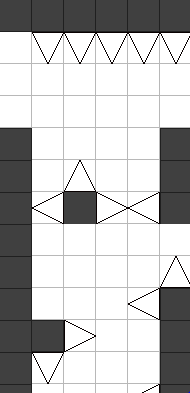


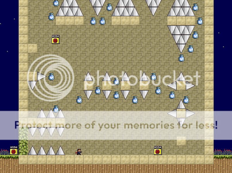
I choose a white background for the laboratory sections of the game because the color has a lot of connotations with cleanliness and sterility. It's also an easy color to create contrast with, since using darker colors for blocks doesn't make platforming any harder (as opposed to using it as the background.) The lines exist to create texture, and provide a certain sense of realism to an otherwise abstract setting. Something to note is that they are a fairly neutral color, breaking up what is otherwise an uncomfortable imagine to look at. While a slightly uncomfortable setting was what I was aiming for, that is different from making it outright unpleasant to be looking at. The lines also allowed the possibility for some visual accents such as these:


They break up the consistency of the black and white screens with some splashes of vibrancy, and add to a bit of mystery regarding the setting itself.

Unfortunately, the way I designed this left me with an annoying visual problem, which is a large number of visual tangents. Looking closely at the screenshot, you can see that some things don't quite line up in terms of the background grid, foreground tiles, and foreground spikes. If I had to make recommendations to other people considering the same sort of thing, it would be to use tiled backgrounds that do not fit as perfectly on the 32x32 (or 16x16) grid so as to differentiate more between the background and foreground.

Throughout the rest of the game I used an array of visual miscellanea to create the sense that the player was traveling through a setting with at least some basis in reality. Desks, computers, and filing cabinets all are stables of offices (even if my renderings of them were not particularly detailed.) The shocking number of disembodied heads and flickering screens full of weird stuff were intended to be ominous. Enormous containment tubes full of mysterious liquids (and for some reason jump refreshers) as well as an abundance of glowing portals lent themselves to the “weird science” atmosphere I was trying to create. Almost none of these things had any real effect on game play, but without them the setting feels empty, and does not even begin to convey the emotions I wanted.

All of those props are about as realistic as can be found in a fangame. That is to say, you could reasonably find things with distinct similarities in reality without it being too strange. If you're looking to make a game with extremely abstract visuals but is more than the generic “single color block, single color background” that we've all come to expect, I would suggest examining the games by the GENKI creator. There are some excellent example in their games of abstracted but consistent visuals that are used to create, well, weirdness.

Consistency:
Since I warned against inconsistency in terms of the blend of realistic and abstract visuals when I introduced this concept, I thought this might be a good place to introduce an example of how willingly violating that general rule can be used to great positive effect. In I Wanna Stop the MELTDOWN, a game I would argue to be fairly realistic in its visual style, there is a transition into almost total abstraction induced by hallucinogenic mushrooms. I have never seen anything but extremely positive reactions to this, which I would explain by the presence of three factors (aside from simply being well made of course.)

First, an actual explanation to the visual transition is provided. While logical things have never been particularly central to fangames, it's nice to be able to thing “oh, that's why this thing is happening.” Secondly, there is an actual transition into the new visual style, negating some of the jarring sensation that might otherwise be experiences. Third, the abstract area has a sense of internal logic to its appearance: a combination of the heart motif, light colors, and cheerful music. This creates a sense of consistency, and at least partially staves off the question of if the player is even playing the same game anymore.

Just because you have started with one distribution of realistic and abstract visuals does not mean you are bound to it for the entirety of the game, but give some thought to how your shifts in them will be perceived and how they can work in your favor. A game in which the player is slowly losing their grip on sanity, which is reflected by increasingly abstract graphics, stranger music, and more complicated gimmicks, is much more compelling as a whole than something more haphazardly thrown together, even if it has all those elements at one place or another. If your game is consistent in moving from one distribution to another, the individual changes in screens or areas do not matter as much as long as they follow the pattern.

Colors:
I don't really have much to say about them in terms of examples aside from what I noted earlier. As with everything else, just try to consider if your decisions regarding them work toward your overall goal in the creation of a game.

TL;DR:
When choosing or creating the visual elements of the game, be sure to consider how exactly your choices affect other elements of the game. Does anything stand out because it doesn't mesh with the style you've developed? Is a specific section that requires staring at the screen full of colors that hurt the eyes? There are plenty of things that deserve more consideration than they get in this day and age of design.

4
Game Design / Some Thoughts on Game Design
« on: January 31, 2016, 09:11:59 AM »
I'd like to talk about game design for a bit. According to my best estimates, I've been making fangames for about two and a half years now. That's by no means the longest among everyone, but it's not an insignificant amount of time either, and I think some of the things I've learned might be useful for newer creators. Think of the following as some thoughts for people who know how to make games, but aren't sure what exactly to do with that knowledge on a larger scale.

A few notes before I start:
  • Everything here is based on my opinions and some general observations of other people's opinions too. There are always going to be individuals with different tastes, so be sure to consider who your intended audience is.
  • Even if you think what I'm saying is reasonable, there's always a time and place to go against the grain. Blindly following good advice is only somewhat better than not following it at all.
  • And as always the most important thing is to have fun with what you're doing!

I'm going to begin with some broad concepts and then work my way down to how they can apply to individual screens and even individual segments of those screens. You can skip to the second post if you just want to read about making rooms.

Game Narrative:
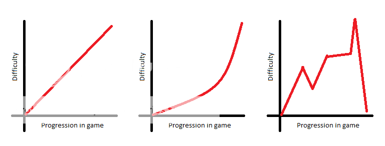
This concept has a few things to do with storytelling in any other sense, but it might be easier to think of it in terms of the difficulty curves everyone's always talking about. Here are some examples:


It's a bit of a misnomer since they don't exactly need to be curves. Even a game with unchanging difficulty can be said to possess one, though it's not probably not very interesting. When I say game narrative, I'm referring to the concept of taking a player from a distinct start point to a distinct end point, with a bunch of stuff in between. This might seem like a given. Of course a player is going to start somewhere, end somewhere, and do stuff in between, but framing in this manner helps isolate important questions for the game maker:
  • How hard does your game start and how hard does it finish? How gradual is the change from one to the other?
  • How does the atmosphere you're conveying change over time? Are any abrupt shifts made for a particular reason?
  • Are your bosses or other significant events following buildup? If not, why do you want them to appear suddenly?

Again, these are all important even if you don't plan on having a story in your game.


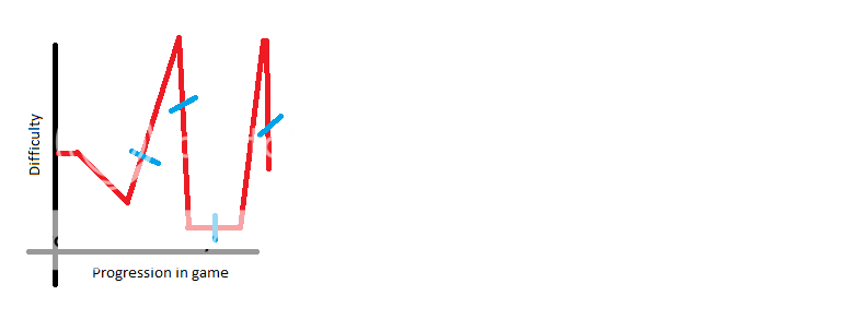
Picture playing a game with that difficulty curve where every blue notch marks a boss. It's not a well-balanced curve in the first place obviously. The end is a bit easier than the start and there's huge variety in between, but it's made even worse by the haphazard placement of bosses. This is especially true if the bosses themselves are vastly more or less challenging than the platforming.

Imagine doing a few basic jumps, fighting an incredibly challenging boss, and then getting right back to the same few basic jumps. There's no sense of progression, no sense that beating the boss accomplished anything or marked a change, only the sense that an unreasonably difficult barrier had been stepped over.

Alternatively, what if the blue notches were changes in music or graphics? They don't come at significant times certainly. They probably don't mark the appearance of a new mechanic or a change in a stage. They're less offensive when placed haphazardly than bosses, but they aren't exactly doing anything for you in terms of building a holistic game experience.

I'm mentioning this at the start because it should probably be the first thing you think about while making a game. Where do you want to start, where do you want to end, and what do you want to show the player in between?

Game Flow:
You might think of game flow as the connectivity of the important points in your game's narrative. Overall you go from point A to point Z, but to do that you usually need to go from A to B, B to C, C to D, and so on. Unless your game only consists of a single room you are going to have to address how the player moves from one to another. You may want to decide what kind of atmosphere you're attempting to create (which is why it's a good thing to consider something like that before reaching this point.)

Consider this: Not Another Needle Game (widely regarded as a classic) is a fangame with an incredibly strong and consistent atmosphere. A significant part of this is the ever-present narrator, but the way the rooms are connected plays an important role as well. The fact that nearly every room ends with a portal to the next one emphasizes the feeling of being helpless at the hands of a merciless AI. A sense of progression is maintained by the numbering of levels, but there's rarely an impression of moving in a particular direction or getting any closer to the ultimate goal. You do a thing, you get the next thing to do, and you're laughed at the entire time.

If you want to make a game with a sense of direction instead, you might want to include obvious entrances and exits to every screen that at properly linked together. This way the player can clearly see where they started and where they're going at any point, and can understand that going from one screen to another is clearly leading them somewhere. It just depends what you want players to take away from playing your game.

Determining how you're going to deal with transitioning between screens is important when it comes to pure platforming as well. There are some general things that are basically good manners at this point: don't have spikes right on the other side of a screen edge, don't teleport the player into something they need to react instantly to, (usually) give them a save immediately. You can think about this as a check against rampant difficulty peaks or valleys too. When starting on a new screen, ask yourself if what you're creating is significantly different in terms of difficulty than what was on the last one. If it is, you might want to consider re-balancing unless you're planning on a very steep curve the entire game.

Mechanics:
These also get called gimmicks a lot, but that suggests a certain cheap novelty to them. What I'm referring to could most accurately be described as “platforming accents,” but that's sort of dumb so let's stick to calling them mechanics. There's a vast array of already existing, fairly standard ones such as jump refreshers, vines, gravity flips, conveyor belts, and springs. Depending on how strict your definition of basic platforming is, you might even include water and spike triggers in that list. There are rarer mechanics too of course: triple jump segments, single jump ones, various speed augmentations, size changing, etc. Really, there are too many for me to even try listing them all, especially if I were to include the ones that only really exist in one or two games.

The reason I'm bringing this up before I talk about the actual implementation of mechanics is because there's some more large-scale consideration to be done of them. With more graphs!


This is the mechanics chart for my first game, I Wanna Descend Into Hell. As you can see, I started out with jump refreshers and then kept adding more mechanics, never really removing any of them completely. Not that everything I implemented appeared in every screen, but none of them were ever particularly absent for a long stretch of time once introduced. As you might imagine, it got a little painful by the end to try and stuff everything together at once.


This is the same sort of chart for another game of mine, I Wanna REDACTED the REDACTED. There was significantly less overlap until the near the end. This led to a few accusations of staleness from certain people, but I doubt they would dispute that it was a much cleaner experience than my first game.

I don't present these charts to suggest that there is a right way and a wrong way to implement mechanics in your game. It's perfectly reasonable to have one mechanic a stage, or none at all, or all of them all the time. I would just encourage you to devote some thought to why you're making it the way you are. A game with more isolated fragments is probably better suited thematically to a fractured approach, whereas one where the player is supposed to be building up to something big the entire time would probably mirror that in mechanics. It all leads back to that original question of how exactly you want things to change from the beginning of the game to the end.

Platforming:
I don't want to say too much about going above, under, and around spikes and apples in this section. We'll definitely come to it more later. I just want to give a few recommendations of things to think about when you're working out what exactly kind of game you want to make.
  • Can you actually play the game you're making? If not, I would recommend not making it in that state. If you insist, you absolutely need to find people to test it who can.
  • Do you expect any particular knowledge from the player? Things like aligns are pretty common knowledge these days, but you may want to decide to what degree you'll make that knowledge required to beat your game.

So now that that's out of the way, let's talk about room design!

5
Game Design / Making a Spoilerless Readme (GMS)
« on: January 09, 2016, 10:24:34 AM »
So you want to make a game. You want to properly document the resources that you're using in the game because you're not an asshole, but you also don't want to reveal something about the game. Secret final boss? Elaborate plot twist? Some things should only be known after the game is beaten and making credits is pain! Here's a solution for you.

First, you need the GMFileSystem extension. You can get that at https://gmc.yoyogames.com/index.php?showtopic=567528. Unfortunately, this is necessary because of the way Game Maker Studio is constructed. With the base program you can't easily interact with files outside of their %appdata% home, which is generally unhelpful given the traditional packaging of fangames. This extension supports interaction with files in other locations.

Second, create a new script. Call it whatever, it doesn't particularly matter. Try WriteReadme or something. Put the following into it:
var file;
file = FS_file_text_open_write(working_directory + 'Readme.txt');
FS_file_text_write_string(file, "Designed by whoever

Song List:
Sick beats

External Resources:
amazing sprites.");
FS_file_text_close(file);

This will create a text file (in this case called Readme.txt) in the folder containing the executable, which will have this text in it:
Designed by whoever

Song List:
Sick beats

External Resources:
amazing sprites.

Now just execute that script whenever you want the readme to be added to the folder. I know what you're saying already though. "But Kyir, I just want to add resources stage by stage whenever they appear!" Nothing simpler!

Once you've created the readme, either by this method or with a traditional one, you just need to substitute in
file = FS_file_text_open_append(working_directory + 'Readme.txt') 

and whatever text you add with it should appear at the end of whatever is in the file already. In this case, you'll probably want to create a system that will allow a lot of slight modifications, such as making the string in the script a variable and creating an object whose creation code sets the string and executes the script on collision, but I trust you all to figure out stuff like that!

There are other finer tweaks you can do too if you use the commands found in the extension's documentation: httpss://dl.dropboxusercontent.com/u/61559928/filesystem/GMFilesystem_Documentation.1.5.pdf.

Good luck and godspeed in improving the minutiae of your games!

6
User-Made Creations / I Wanna REDACTED the REDACTED
« on: November 02, 2015, 11:52:25 PM »
The penultimate game of a truly thrilling fangame series! Be astounded by the sheer number of jump refreshers!
Be entraced by the vague storyline! Most of all, do your best to enjoy your time playing.

This game is targeted at players of intermediate skill, contains secrets, and has multiple possible endings.


The latest version of the game was uploaded on 11/4/2015, 11:30 AM EST

Download: https://www.mediafire.com/download/3t9zv3hk509m31w/I+Wanna+REDACTED+the+REDACTED.rar

7
User-Made Creations / I Wanna Usurp the Celestial Jump
« on: June 22, 2015, 07:13:21 PM »
"And the angel shattered the darkness with its radiance, glass skin shining and storm inside roiling, and it said unto me that the LORD my God required a great feat of me. I was to build a tower that would pierce the heavens with its spire and rend the earth with its foundation. And once my task was complete the LORD my God would open the gates of heaven to me and mine." - Refresher 20:13-16

I Wanna Usurp the Celestial Jump
Created by Kyir
I Wanna be the Engine KS Edition


https://www.mediafire.com/download/1wcz759c252w8d8/I+Wanna+Usurp+the+Celestial+Jump.rar

8
Programming Questions / Affecting Existing Objects
« on: June 15, 2015, 01:54:45 PM »
Is there a more elegant/simple/whatever was to affect objects that already exist when something occurs other than making them all check for variables in their step events? For example: if object A and B exist, and I want to make something happen to object B when object A gets shot.

I feel like there's gotta be something, but finding it in the depths of game maker's help feature is beyond me. 

9
Maker Profiles / Kyir's Fangame Emporium
« on: December 31, 2014, 12:44:31 AM »
I don't feel like rewriting a lot of this, but basically a bunch of stuff got copyright reported on mediafire. Almost all of my games are available via the file I uploaded to the wiki called "I Wanna Be the Fangame Archive"

10
User-Made Creations / I Wanna Praise the Sun
« on: September 29, 2014, 03:37:01 AM »
Exciting new game from well-renowned gamemaker! (Hint: it's me)

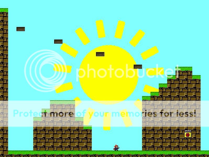
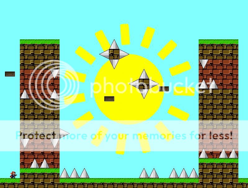
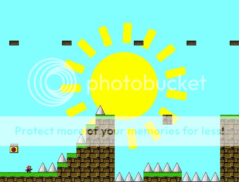
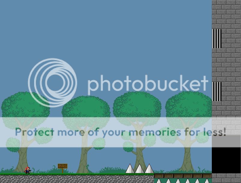
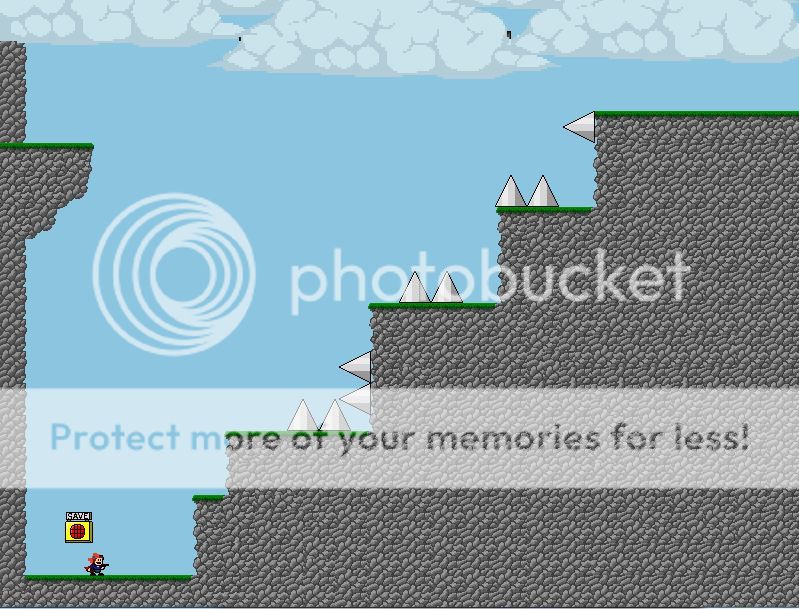
Screenshots:
(click to show/hide)

Feature list:
- Colorful graphics!
- Cheerful music!
- No jump refreshers! (unfortunately!)

I hope you all enjoy the product of my hard work!

Download:
https://www.mediafire.com/download/565k8cgzrbpekpt/I+Wanna+Praise+the+Sun.rar

11
Unfinished / Incomplete / I Wanna 100 Floors
« on: June 12, 2014, 11:17:45 PM »
I don't really feel like finishing this game any time soon, but it feels like a waste to just let 30something screens sit around on my hard drive.

https://www.mediafire.com/download/m1q7ebbp6s2gb1g/I_Wanna_100_Floors_this_shit.rar


12
User-Made Creations / I Wanna Deracinate the Walls of Theodosius II
« on: June 04, 2014, 12:31:34 AM »
A fangame long in development! I know a ton of hype surrounds it already, but I promise it completely lives up to all expectations had of it. Expect over a hundred hours of playtime in a breathtakingly well-crafted worlds, navigating jumps never seen before by mortal eyes!

Screenshots:


Download:
https://www.mediafire.com/download/l3rl22zkkv3lsup/I_Wanna_Deracinate_the_Walls_of_Theodosius_II.rar

13
Programming Questions / Apply Spray Code
« on: June 02, 2014, 10:37:36 AM »
Could anyone outline the kind of code that's used for the attacks in avoidance fights where apples are sprayed in a general direction but with RNG? I'd appreciate it a lot.

14
4 zones, 8 secrets and no corner jumps!

This is my entry for YoSniper's fangame contest (though there's a larger version coming once the contest ends that includes jump refreshers.) It's honestly not particularly hard or innovative, but which of my games are?


Download (Contest Edition):
https://www.mediafire.com/download/zzzajaufnlb6ff3/I+Wanna+Conceptualize+the+Omnitruncated+Tesseract+Contest+Edition.rar

Download (Deluxe 100% Gold Premium Early Backer #SWAG Edition):
httpss://www.mediafire.com/?c4ytmuzsql87xsj

15
They're both short games, and I don't feel like making a thread for each.

I Wanna Immanentize the Eschaton
  • ~30 minutes
  • A single meaningless secret
  • Super Meat Boy sprites

Screenshots:


https://www.mediafire.com/download/rc5mt2ni5h7x3t5/I+Wanna+Immanentize+the+Eschaton.rar

I Wanna Formulate the Categorical Imperative:
  • It's moderately long I guess?
  • There probably aren't any secrets?
  • I made all the non-default sprites but they're pretty boring (except the Terraria jump refresher)

Screenshots:


https://www.mediafire.com/download/g50q3c4p8kutp0k/I+Wanna+Formulate+the+Categorical+Imperative.rar

Pages: [1] 2